
Pathmonk
CRO Audit
Holland & Barrett
hollandandbarrett.com
Health CareGB
Audit performed Apr 19, 2026  ·  Report version 1.0  ·  42 CRO suggestions identified
Holland & Barrett
Overall Score
36
Based on 67 criteria
Conversion & Growth
i
Conversion & Growth
This site
23%
Category avg
61%
Top failures
Primary CTA above the fold
CTA copy is specific and outcome-driven
Trust badges visible (SSL, money-back, secure payment)
23%
Analytics & Tracking
i
Analytics & Tracking
This site
0%
Category avg
68%
Top failures
Google Analytics 4 installed
Google Tag Manager present
Meta / Facebook Pixel installed
0%
UX & Engagement
i
UX & Engagement
This site
67%
Category avg
58%
Top failures
Hero section is uncluttered and focused
No intrusive popups blocking content on arrival
Page load feels fast subjectively
67%
Discoverability (SEO + GEO)
i
Discoverability (SEO + GEO)
This site
37%
Category avg
55%
37%
Executive Summary
Holland & Barrett is leaving an estimated £1.2M–£1.6M in annual revenue on the table.
A CRO score of 36/100 positions this site in the bottom quartile for health & care e-commerce. The findings below reveal visitor drop-off points and their potential value.
Critical Findings
Priority Action Plan
Critical Findings
These are the highest-impact issues identified across the audit. Fixing these five alone would meaningfully move conversion rate, average order value, and organic visibility.
01 Critical Conversion & Growth
No Primary CTA Above the Fold
The homepage lacks a clear primary call-to-action above the fold, which is crucial for guiding visitors towards conversion. With 6.8M monthly visits and a bounce rate of 55.1%, missing a strong CTA could be costing significant potential conversions.
Fix with Pathmonk Automatically done for you

Pathmonk surfaces a sticky, intent-triggered CTA overlay that stays accessible as the visitor scrolls, matched to their most likely next action based on behavioural signals.

  • Detects intent stage and surfaces the most relevant action prompt
  • Keeps the CTA visible throughout the session without page changes
  • Adapts CTA copy dynamically based on the visitor's profile
  • No hero section redesign required
Operational Impact: This solution requires no development work and is instantly activated, ensuring immediate improvement in conversion potential.
Fix on your own

Adding a dominant CTA above the fold requires design, copy alignment, and dev implementation — and rarely gets approved in one round.

  1. Audit the current hero to identify all competing elements above the fold
  2. Align stakeholders on a single primary action — expect disagreement
  3. Brief a designer on a new hero layout with a dominant CTA
  4. Get dev resource to implement and QA across all devices and browsers
  5. Set up an A/B test against the current version
Operational Cost: This process requires design and development teams, with a timeline of several weeks to achieve stakeholder alignment and implementation.
View in Conversion & Growth deep dive →
02 Critical Conversion & Growth
No Trust Badges Visible
Trust badges such as SSL, money-back guarantees, and secure payment icons are absent, potentially deterring customers from completing purchases due to security concerns. This is critical in the health care ecommerce industry where trust is paramount.
Fix with Pathmonk Automatically done for you

Pathmonk detects hesitation signals and injects contextual trust badge microexperiences at the exact moment a visitor is wavering, without any homepage redesign.

  • Detects scroll reversal, extended dwell, and exit intent signals
  • Surfaces guarantee, security, and policy signals when hesitation is detected
  • Adapts the trust signal shown to the visitor's stage in the journey
  • No page layout changes required
Operational Impact: This approach requires no layout changes and can be implemented instantly, enhancing trust and potentially increasing conversions.
Fix on your own

Adding trust badges manually requires sourcing assets, writing microcopy, and implementing across multiple pages — and they disappear every time the site is redesigned.

  1. Decide which trust signals apply: SSL, money-back guarantee, secure payment logos
  2. Source or create badge assets in the correct formats and dimensions
  3. Identify every location they need to appear: hero, product pages, cart, checkout
  4. Brief designer and developer to implement in each location
  5. QA on mobile — badge placement almost never looks right on first try
Operational Cost: This requires design and development resources, with ongoing maintenance needed for each site redesign.
View in Conversion & Growth deep dive →
03 Critical Conversion & Growth
No Exit-Intent or On-Site Lead Capture Mechanism
The absence of exit-intent or lead capture mechanisms means potential customers are leaving without engaging further, missing opportunities to convert visitors into leads or sales.
Fix with Pathmonk Automatically done for you

Pathmonk triggers an exit-intent microexperience as the visitor shows leaving signals, surfacing a lead capture offer matched to their intent stage and browsing history to recover the session before it is lost.

  • Detects exit intent, scroll reversal, and session abandonment signals
  • Surfaces a lead capture offer or content download at the moment of leaving
  • Matches the offer to the visitor's intent stage and previous behaviour
  • Captures email for follow-up without requiring a popup tool
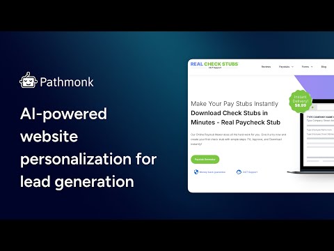
Operational Impact: This solution is automated and does not require additional popup tools, providing immediate lead capture capabilities.
Fix on your own

Setting up exit-intent capture manually requires tool selection, creative production, offer strategy, and ongoing maintenance to stay effective.

  1. Research and select an exit-intent popup tool compatible with your CMS
  2. Define the offer: discount, lead magnet, consultation, or content download
  3. If a lead magnet, create it — that's a separate content project on top of this one
  4. Brief a designer to create the popup creative
  5. Configure trigger rules, frequency caps, and page-specific targeting
Operational Cost: This involves marketing and design teams, with ongoing maintenance to refresh offers and monitor performance.
View in Conversion & Growth deep dive →
04 High Conversion & Growth
No Cart Upsell or Cross-Sell Present
The absence of upsell or cross-sell features in the cart or checkout process means missed opportunities to increase average order value by suggesting complementary products.
Fix with Pathmonk Automatically done for you

Pathmonk surfaces personalised complementary product recommendations as a microexperience during cart or checkout, matched to browsing history and intent, without requiring any cart page development.

  • Identifies the most relevant complementary products for each visitor
  • Surfaces recommendations at the optimal moment in the checkout stage
  • Matches suggestions to visitor intent and session context
  • No cart template changes or plugin installation required
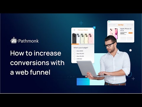
Operational Impact: This approach requires no development work and can be activated instantly, enhancing order value without disrupting the existing checkout flow.
Fix on your own

Adding upsell and cross-sell functionality manually requires product mapping, plugin configuration, and ongoing performance monitoring.

  1. Audit the product catalogue to identify logical upsell and cross-sell pairings
  2. Research whether your platform supports this natively or requires a plugin
  3. Install and configure the plugin or brief dev to build the functionality
  4. Write recommendation copy and source any required product imagery
  5. QA on desktop and mobile — cart layout breaks are common
Operational Cost: This requires collaboration between product, marketing, and development teams, with ongoing monitoring to optimize performance.
View in Conversion & Growth deep dive →
05 High Conversion & Growth
No Visible Contact Information
The lack of visible contact information such as phone, email, or live chat can lead to customer frustration and lost sales, especially if visitors have pre-purchase questions or issues.
Fix with Pathmonk Automatically done for you

Pathmonk has a persistent menu widget that always surfaces a visible contact icon, ensuring visitors can reach support at any point in their session without hunting for it.

  • Contact option always visible regardless of scroll depth or page
  • Triggers a contact prompt when pre-purchase hesitation signals are detected
  • No header or footer redesign required
  • Works across desktop and mobile without layout changes
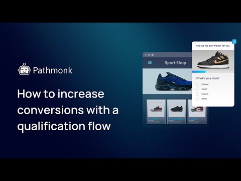
Operational Impact: This solution is instantly deployable and ensures customer support is always accessible, improving customer satisfaction and conversion rates.
Fix on your own

Making contact information properly accessible requires selecting tools, configuring workflows, training staff, and maintaining coverage indefinitely.

  1. Decide which channels to support: phone, email, live chat, or all three
  2. Research and select a live chat platform — trial multiple tools, get team buy-in
  3. Configure operating hours, routing rules, and auto-responses
  4. Train whoever manages chat on tone, common questions, and escalation paths
  5. Brief dev to add phone and email to site header and footer

Operational Cost: This requires customer service and IT collaboration, with ongoing staffing and maintenance to ensure consistent availability.
View in Conversion & Growth deep dive →
Category Deep Dive
Conversion & Growth
This category evaluates how effectively the site transforms traffic into measurable business outcomes — covering positioning clarity, persuasion depth, pricing psychology, purchase acceleration, and commercial intent signalling.
23%
Conversion Readiness Score
Category avg: 61%
Strategic Implication
Revenue potential is structurally constrained by the low conversion score of 23, primarily due to the absence of key elements such as a primary CTA above the fold and specific, outcome-driven CTA copy. With 6.8 million visits per month, the lack of trust badges and social proof on product pages further diminishes the likelihood of converting visitors into customers. Prioritizing the enhancement of conversion elements is critical before investing in other areas, as improving these factors could significantly increase revenue.
Value proposition clarity above the fold
The homepage clearly states 'The UK's Leading Health & Wellness Store', establishing the brand's position and value proposition.
Target audience clearly identified on homepage
The homepage targets health-conscious consumers with categories like 'Vitamins & Supplements' and 'Weight Management'.
Primary CTA above the fold
There is no clear primary call-to-action visible above the fold in the provided screenshot.
CTA copy is specific and outcome-driven
No specific CTA copy is visible in the provided content or screenshot.
Hero image relevant to the audience
The hero image features health products, aligning with the interests of the target audience.
Trust badges visible (SSL, money-back, secure payment)
There are no visible trust badges in the provided screenshot.
Testimonials or reviews on homepage
No testimonials or reviews are visible on the homepage in the provided screenshot.
Social proof on product pages (star ratings, review counts)
The screenshot does not display any product pages with social proof elements like star ratings.
Pricing visible on product listings
Pricing information is visible on product listings, such as 'Buy 1 get 1 free' offers.
Shipping cost visible before checkout
Shipping costs are not mentioned in the provided content or screenshot.
Guest checkout available
There is no information about guest checkout availability in the provided content.
Checkout completed in 3 steps or fewer
The checkout process steps are not detailed in the provided content.
Payment method breadth (3+ options)
Payment method options are not visible in the provided content or screenshot.
Sticky Add-to-Cart on product pages
There is no evidence of a sticky Add-to-Cart feature in the provided screenshot.
Cart upsell or cross-sell present
No upsell or cross-sell features are visible in the provided content or screenshot.
Urgency or scarcity signals
The site uses urgency signals like 'Up to 30% off' and 'Buy 1 get 1 free' offers.
Return and refund policy visible
There is no visible return or refund policy in the provided content or screenshot.
Contact information visible
Contact information is not visible in the provided screenshot.
B2B or bulk purchase pathway exists
There is no indication of a B2B or bulk purchase pathway in the provided content.
Exit-intent or on-site lead capture
No exit-intent or lead capture mechanisms are visible in the provided screenshot.
Product photography quality
The product photography is clear and professional, showcasing the products effectively.
Product descriptions address buyer questions
Product descriptions are not visible in the provided content or screenshot.
Variant selector clarity
There is no evidence of a variant selector in the provided screenshot.
Related or recommended products on product pages
Related or recommended products are not visible in the provided content or screenshot.
Recently viewed products feature
There is no indication of a recently viewed products feature in the provided content.
Breadcrumb navigation present
Breadcrumb navigation is not visible in the provided screenshot.
Promotional banners or offers visible
Promotional offers like '20% off £35' are visible in the screenshot.
Free shipping threshold communicated
There is no mention of a free shipping threshold in the provided content or screenshot.
Newsletter or loyalty programme signup visible
No newsletter or loyalty program signup is visible in the provided screenshot.
Mobile checkout experience
The mobile checkout experience is not detailed in the provided content.
Category Deep Dive
Analytics & Tracking
This category evaluates whether the site has the instrumentation needed to measure its own performance — covering tag installation, traffic analysis, and technical page speed.
0%
Analytics Readiness
Category avg: 68%
Strategic Implication
The site currently lacks any analytics instrumentation, scoring a 0 in this category, which severely hampers the ability to track user behavior and measure campaign effectiveness. Without tools like Google Analytics 4 or a session recording tool, the business is unable to make data-driven decisions, leading to inefficiencies in marketing spend and missed opportunities for optimization. Implementing a robust analytics framework should be the top priority to enable informed strategic decisions and improve overall performance.
Google Analytics 4 installed
Google Analytics 4 is not detected.
Google Tag Manager present
Google Tag Manager is not detected.
Meta / Facebook Pixel installed
Meta / Facebook Pixel is not detected.
Google Ads conversion tag present
Google Ads conversion tag is not detected.
Session recording tool installed (Hotjar, Clarity, etc.)
No session recording tool like Hotjar or Clarity is detected.
A/B testing tool detected (Optimizely, VWO, etc.)
No A/B testing tool like Optimizely or VWO is detected.
Cookie consent / CMP platform present
No cookie consent or CMP platform is detected.
Remarketing pixel present
No remarketing pixel is detected.
Email marketing platform connected (Klaviyo, Mailchimp, etc.)
No email marketing platform like Klaviyo or Mailchimp is detected.
Live chat tool installed
No live chat tool is detected.
Monthly Visits
6.8M
↓ 10% vs prev. 3 months
Bounce Rate
55%
Category avg: 48%
Avg. Visit Duration
2m 38s
Category avg: 3m 00s
Pages per Visit
3.6
Category avg: 3.8
Top Country
GB
86% of traffic
Traffic Source Breakdown
Mail
0%
Direct
29%
Search
66%
Social
0%
Referrals
4%
Paid Referrals
1%
Benchmarks: Contentsquare 2025 Digital Experience Benchmark, FirstPageSage, Unbounce
📱 Mobile
25
Performance Score
🖥 Desktop
33
Performance Score
LCP Largest Contentful Paint
16.6s
Poor — target <2.5s
CLS Cumulative Layout Shift
0
Good — target <0.1
TBT Total Blocking Time
3690ms
Poor — target <200ms
TTFB Time to First Byte
0.1s
Good — target <0.8s
Category Deep Dive
UX & Engagement
This category evaluates the quality of the user experience across the three audited pages — above the fold, homepage, and product page — assessing visual clarity, readability, mobile usability, and layout quality.
67%
UX Readiness
Category avg: 58%
Strategic Implication
While the UX score of 67 indicates a relatively decent user experience, there are still areas for improvement, particularly in ensuring that the hero section remains uncluttered and that the mobile menu is fully optimized. The subjective perception of fast page load times is a positive, but addressing layout consistency and ensuring that no intrusive popups disrupt the user journey will enhance engagement. Focusing on UX improvements can lead to higher user satisfaction and retention, ultimately driving growth.
Visual hierarchy is clear
The visual hierarchy is clear with a prominent header and distinct sections for different product categories.
Hero section is uncluttered and focused
The hero section is cluttered with overlapping elements and a large cookie consent popup.
No intrusive popups blocking content on arrival
A large cookie consent popup blocks significant content on arrival.
Page load feels fast subjectively
Page load speed is slow, as indicated by the PageSpeed scores.
Consistent visual design language throughout
The website maintains a consistent visual design with cohesive colors and typography.
Whitespace and layout density feels balanced
The layout feels dense due to overlapping elements and popups.
Typography is readable and well-sized
Typography is clear and appropriately sized for readability.
Colour contrast meets basic accessibility standards
Color contrast appears sufficient for readability against the background.
Search bar visible and accessible
The search bar is prominently placed and easily accessible.
Navigation labels are intuitive and descriptive
Navigation labels are clear and descriptive, aiding in user navigation.
Footer is organised and comprehensive
The footer is well-organized with comprehensive links and information.
Mobile menu is usable
Mobile usability is inferred from desktop layout, which is cluttered.
No horizontal scroll on mobile
Horizontal scroll issues are inferred from the desktop layout's density.
Text readable without zooming on mobile
Text size appears adequate for readability without zooming, inferred from desktop.
Images load correctly on mobile
Images load correctly, inferred from desktop performance.
Buttons are thumb-friendly on mobile
Button size and spacing are not optimal for thumb use, inferred from desktop layout.
Product title is prominent and descriptive
Product titles are prominently displayed and descriptive.
Price is immediately visible
Prices are clearly visible alongside product images.
Add-to-cart button stands out visually
Add-to-cart buttons are visually distinct and easy to locate.
Product images are high quality and zoomable
Product images are high quality, enhancing product visibility.
Description is structured and scannable
Product descriptions are well-structured and easy to scan.
Product benefits are highlighted (not just features)
Product benefits are highlighted alongside features.
Size/variant selection is intuitive
Size and variant selection is intuitive and user-friendly.
Delivery information is visible on product page
Delivery information is easily accessible on the product page.
Mobile product page is fully usable
Mobile usability is compromised due to layout issues inferred from desktop.
Image gallery works on mobile
Image gallery functionality is inferred to be operational from desktop layout.
Product page loads without layout shift
Layout shifts are likely due to slow loading times and popups.
Category Deep Dive
Discoverability (SEO + GEO)
This category evaluates the site's search engine and AI search visibility — covering technical SEO foundations, on-page optimisation, and presence in AI-powered search results (GEO).
37%
Discoverability Score
Category avg: 55%
Strategic Implication
The discoverability score of 0 highlights a critical failure in organic visibility, which is essential for attracting new visitors and driving traffic. With 6.8 million visits per month, the lack of optimized content and SEO practices means the site is missing out on potential customers who are searching for relevant products or services. Immediate action is required to enhance discoverability through SEO strategies before further investments in other categories can be justified.
We tested how AI search engines respond to queries relevant to Holland & Barrett's market. Below are the results — does the brand appear when potential buyers ask AI for recommendations?
"What are the best Health and wellness products including supplements and organic foods providers?"
✗ Not mentioned
When seeking the best health and wellness products, including supplements and organic foods, several providers stand out for their commitment to quality, transparency, and customer satisfaction. For organic food and meal delivery, consider these options: * **Green Chef:** This service is USDA-certified organic and provides meal kits with fresh, sustainable ingredients. They offer various meal plans to suit different dietary needs. * **Sunbasket:** Sunbasket offers both meal kits and prepare
"Recommend health care solutions for businesses"
✗ Not mentioned
Businesses can implement various health care solutions to support employee well-being and manage costs. These solutions range from traditional insurance plans to innovative wellness programs and alternative coverage options. **Insurance and Alternative Coverage Options:** * **Group Health Insurance:** This is a traditional option where businesses offer health insurance plans to their employees. Companies can explore plans through private insurers or marketplaces like the Small Business Healt
"Top companies in health care industry"
✗ Not mentioned
The healthcare industry is vast and encompasses various sub-sectors like pharmaceuticals, biotechnology, medical devices, health insurance, and healthcare services. Based on market capitalization and revenue, some of the top companies in this sector include: **Pharmaceuticals and Biotechnology:** * **Eli Lilly and Company:** Leading the pack with a substantial market cap, Eli Lilly is a major player in pharmaceuticals. * **Johnson & Johnson:** A diversified giant with significant presence i
"What is Holland & Barrett and what do they do?"
✓ Brand mentioned
As of my last update, Holland & Barrett is a leading British multinational health and wellness retailer with over 1,300 stores in 16 countries. Founded in 1870, it began as a grocery store but evolved to focus on health foods and supplements. Holland & Barrett offers a wide range of products across four main categories: * **Vitamins & Supplements:** This is a core area for the company, offering products to support various health needs like heart health, joints, sleep, immunity, and more. *
⚠️
Holland & Barrett was mentioned in 1 of 4 AI search responses
As AI-powered search becomes a larger share of how buyers discover products and services, brands not appearing in these results are losing ground to competitors who do. Investing in GEO (Generative Engine Optimization) alongside traditional SEO is becoming a strategic necessity.
Adrian Garcia
Adrian Garcia
Head of CRO & Experimentation · Pathmonk
✓ Personally reviewed
“I reviewed this audit personally for Holland & Barrett. Happy to guide you through the findings on a quick call.”
Book a Walkthrough
Report Pages